hover-ui
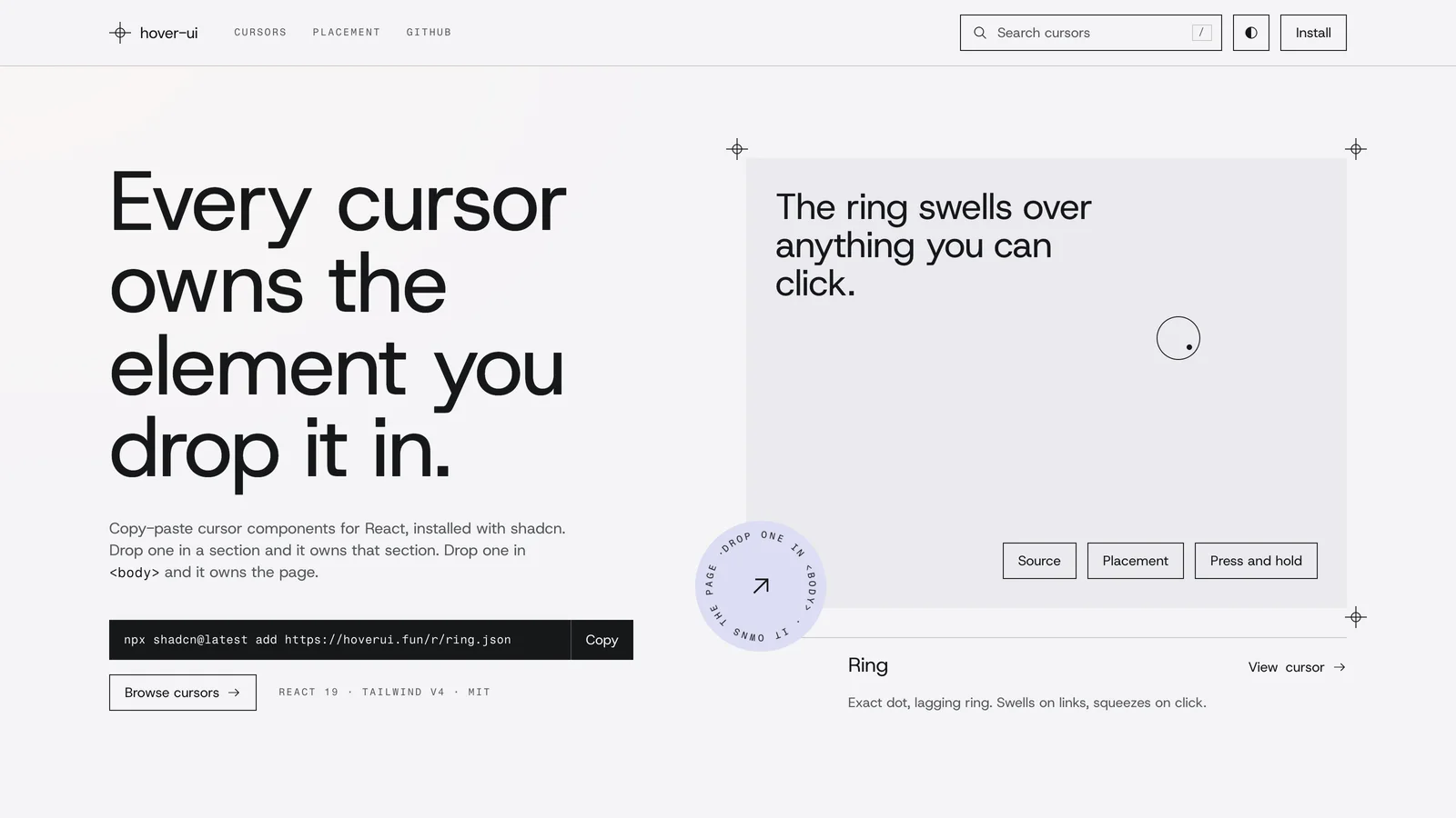
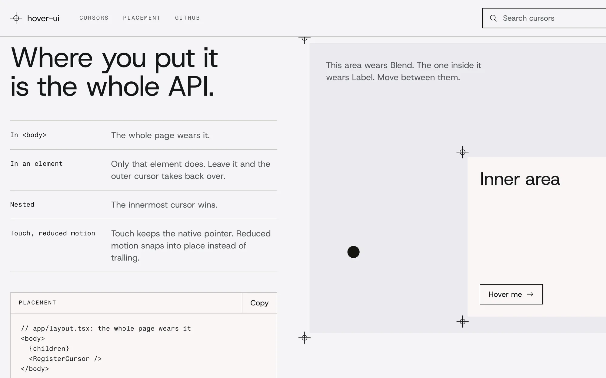
Copy-paste cursor components for React, installed with the shadcn CLI. Drop one in an element and it owns that element’s cursor; drop one in <body> and it owns the page.
How it’s built
- useCursor
- One shared, dependency-free hook every cursor runs on: the cursor’s parent becomes its area, and a function runs each frame while a mouse is inside, with the pointer’s position, press, hover target and easing.
- The cursors
- Each is one readable file that the CLI copies into the project, so there is no package to upgrade.
- The registry
- registry.json lists every cursor, its files and its kind; the shadcn CLI builds the installable JSON from it and installs the hook once, with the first cursor.
- The site
- hoverui.fun, on the Next.js App Router: a live preview, install command, usage, props and full source on every cursor’s page.
What it does
- Placement is the API: no providers, no config. In <body> the whole page wears it; in an element only that element does; nested, the innermost wins.
- Cursors keep the exact hit position, stay off on touch screens and respect reduced motion.
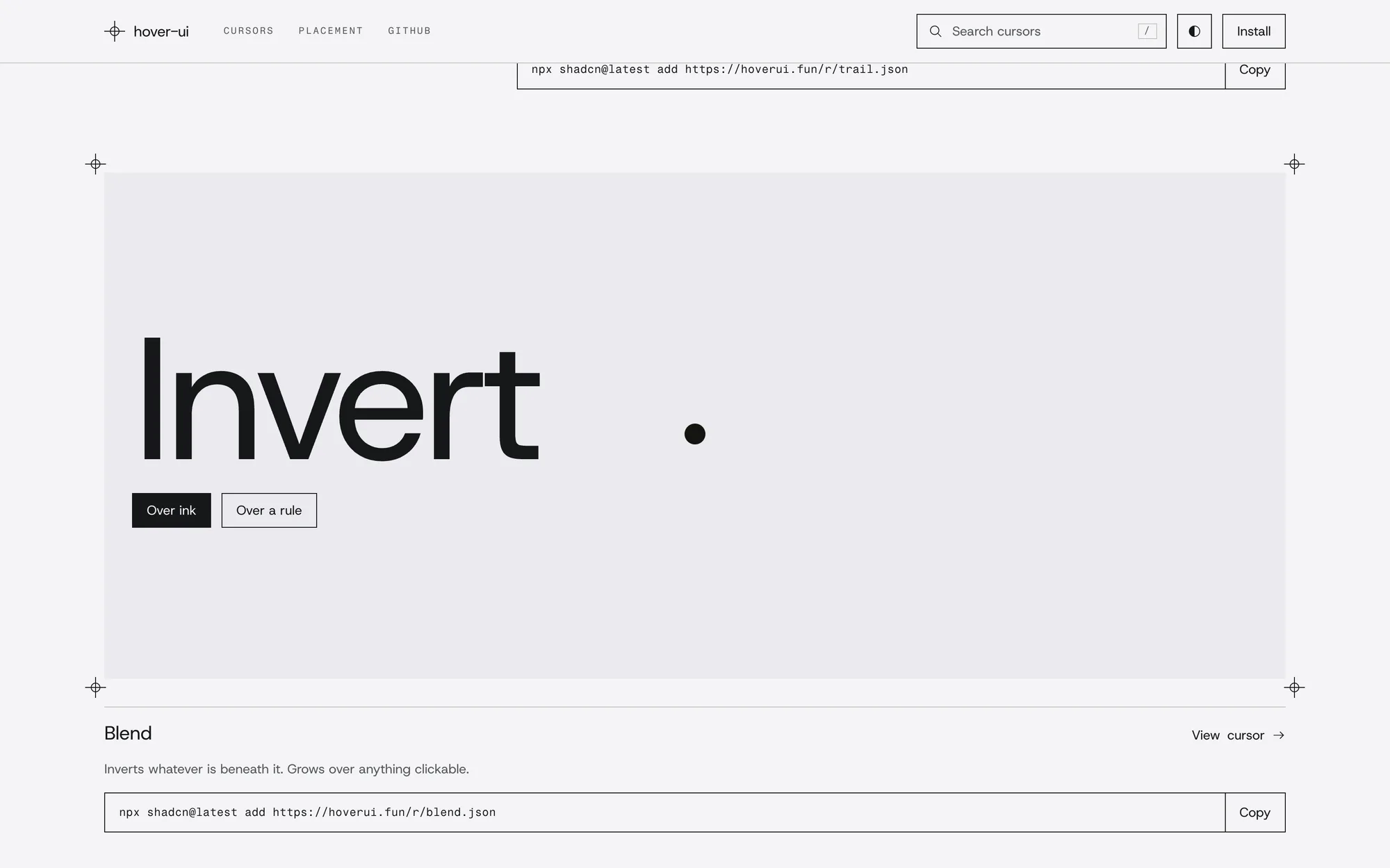
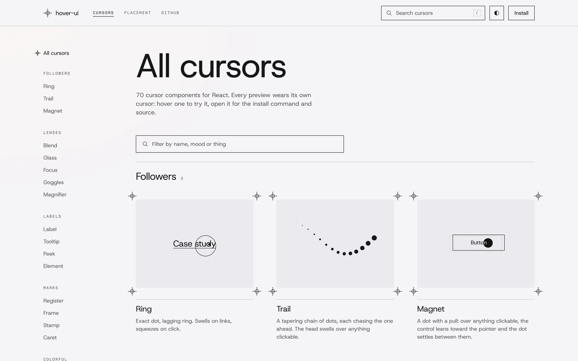
- Cursors grouped by kind: followers, lenses, labels, marks, space, weather, retro, toys, ocean and more.
- A registry namespace for short installs: @hover-ui/<name>.
Screens
Where it sits
Next.js 16 · React 19 · TypeScript · Tailwind CSS v4 · shadcn CLI
By the numbers
- Cursors
- 70
- Needs
- React 19, Tailwind CSS v4, the shadcn CLI
- Runtime dependencies
- None beyond React
Get it
- Browse the cursors (opens in a new tab)
- Install one
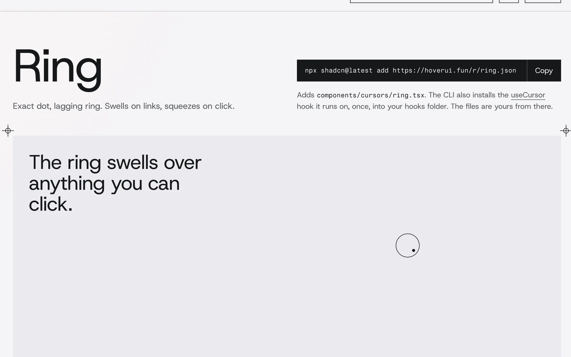
npx shadcn@latest add https://hoverui.fun/r/ring.json
